






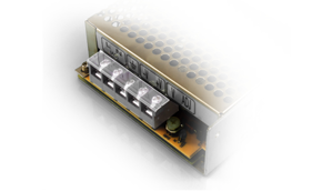
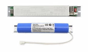
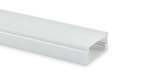


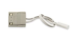
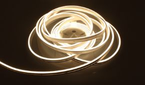

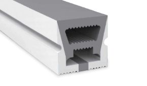
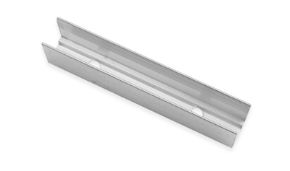


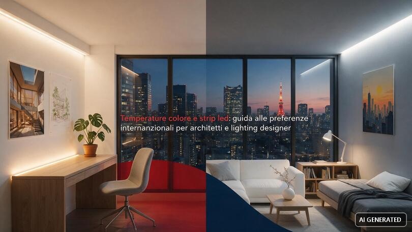
In this guide, we analyse colour temperature from every angle: scientific definition, the Kelvin scale, the differences between warm, neutral and cool light, the impact on visual perception, preferences that vary from country to country, and practical applications across different sectors. We will also explore how these principles translate into concrete choices when working with 2nd generation Neon Flex solutions, a product whose cutting and installation versatility makes it particularly sensitive to the correct management of colour temperature during the design phase.
In this article...
1. What is colour temperature: definition and meaning
Before choosing an LED strip, profile or control system, every designer should answer a simple but often underestimated question: what is colour temperature really for and why can two apparently identical light sources produce completely different atmospheres? The answer is rooted in the physics of light, but its consequences are profoundly design-related, emotional and even commercial.
What is colour temperature
Colour temperature, in English Correlated Colour Temperature (CCT), is the parameter that describes the chromatic tone of the white light emitted by a source, conventionally expressed in degrees Kelvin (K). The concept derives from the behaviour of a theoretical black body which, when progressively heated, changes colour: from the deep red of low temperatures to the white-blue of higher temperatures. A lamp or LED strip that reproduces the shade of that black body at a given temperature is classified with the same Kelvin value, even if the source is not actually incandescent.
In practice, colour temperature tells us whether a light will appear yellow-amber (warm), neutral white or white-blue (cool). It has nothing to do with the physical temperature of the fixture or the heat felt to the touch: an LED strip at 6500K does not get hotter than one at 2700K, it simply produces a different colour rendering.
What is colour temperature used for in a lighting project
For a lighting designer, colour temperature is a narrative tool before it is a technical one. It is used to:
- define the perceived atmosphere of a space (welcoming, professional, dynamic, relaxing);
- enhance materials, surfaces, food and skin tones with the correct colour rendering;
- synchronise artificial lighting with the circadian rhythms of occupants;
- ensure visual consistency between different areas of the same building or brand;
- respond to cultural expectations which, as we shall see, vary considerably from one market to another.
Understanding what colour temperature is therefore means having a design tool as powerful as luminous intensity or the arrangement of fixtures, but much less expensive to correct if planned correctly from the earliest stages of the project.
2. The Kelvin scale: how colour temperature is measured
Once the concept is clear, the next step is to navigate the Kelvin scale, the measuring tool universally adopted by manufacturers, regulations and lighting designers to objectively classify each light source. Knowing the most common Kelvin ranges allows one to translate subjective sensations like "warm light" or "cool light" into concrete numbers.
What is Kelvin and how the unit of measurement works
The Kelvin is the unit of measurement for absolute thermodynamic temperature, but in the field of lighting it is conventionally used to describe the shade of white light. The Kelvin scale applied to colour temperature generally starts from about 1000K (candlelight) and rises to over 15000K (deep blue sky), with a counter-intuitive trend compared to common language: low values correspond to warm, "soft" light, high values to cold, "intense" light.
Table of the most commonly used Kelvin values in LED lighting
| Kelvin value | Light category | Visual appearance | Typical applications |
|---|---|---|---|
| 1900K – 2200K | Extra warm (candle) | Amber, very soft | Scenographic atmospheres, votive lighting, luxury hotels |
| 2700K | Warm white | Yellow-amber, enveloping | Residential, hotel rooms, intimate restaurants |
| 3000K | Warm white | Warm but brighter than 2700K | Living rooms, hotel lobbies, furniture shops |
| 3500K | Warm-neutral white | Transition between warm and neutral | Informal offices, showrooms |
| 4000K | Neutral white | White, natural, without dominant hues | Kitchens, offices, shops, technical environments |
| 4200K – 4500K | Neutral white | Neutral with slight vibrancy | Retail, automotive showrooms, commercial spaces |
| 5000K | Cool white / daylight | Similar to midday daylight | Hospitals, laboratories, production spaces |
| 5500K – 6000K | Cool white | Cool, bright, high contrast | Technical offices, warehouses, street lighting |
| 6400K – 6500K | Intense daylight | White-blue, very energising | Industrial environments, signs, backlighting |
This colour temperature scale is today the reference standard reported on every technical data sheet for LED strips, light bulbs and architectural lighting systems, allowing products from different brands to be compared using a common and objective language.
Why understanding Kelvin ranges avoids design errors
Many design errors arise from a superficial reading of colour temperature Kelvin degrees: a value is chosen "by feel" without considering the cumulative effect with other light sources present in the same environment, such as natural light, existing fixtures or reflective surfaces. A typical mistake is mixing, in the same visual environment, 3000K strips with 4000K spotlights: the result is a perception of chromatic inconsistency immediately evident to the human eye, even to those without any technical training.
3. Warm, neutral and cool light: practical differences
Once familiar with the Kelvin scale, the next step is to understand in operational terms the difference between warm and cool light and how this distinction translates into concrete design choices, from residential to commercial, through hospitality and catering.
Warm light: characteristics and uses
Warm light generally includes the range between 2200K and 3000K. It is characterised by a yellow-amber dominant reminiscent of candlelight or a traditional incandescent bulb. From a perceptual point of view, warm white is universally associated with concepts of warmth, intimacy and relaxation, and is therefore the prevalent choice in residential, high-end hospitality and catering settings.
Neutral light: the point of balance
Neutral light, typically between 3500K and 4200K, represents a functional compromise: it has no evident chromatic dominance and reproduces surface colours faithfully without appearing clinical. It is the most common temperature in work environments, mid-range retail and kitchens, because it guarantees good visual rendering without sacrificing perceptual comfort.
Cool light: when and why to use it
Cool light, from 5000K upwards, has a white-blue dominant that stimulates alertness and concentration. It is used in environments where technical visual rendition prevails over atmosphere: operating theatres, laboratories, industrial settings, food processing areas, security lighting and technical backlighting.
Comparative table: warm, neutral and cool light compared
| Category | Kelvin range | Perceived effect | Ideal contexts |
|---|---|---|---|
| Warm light | 2200K – 3000K | Cosy, relaxing, intimate | Homes, hotels, restaurants, spas |
| Neutral light | 3500K – 4200K | Natural, balanced, professional | Offices, shops, kitchens, showrooms |
| Cool light | 5000K – 6500K | Energising, technical, high contrast | Industry, healthcare, security, backlighting |
One point is often misunderstood: colour is not synonymous with quality. A 2700K LED strip with a good Colour Rendering Index (CRI) reproduces colours as faithfully as a 4000K strip of equal build quality; what changes is exclusively the dominant shade of white light, not its chromatic accuracy.
4. Impact on visual perception and well-being
The choice of colour temperature does not merely produce an aesthetic effect: it directly affects visual physiology, mood and the biological rhythms of the people who inhabit the space. This chapter analyses how environmental perception is influenced by the shade of light, a central theme for those designing environments intended for people's well-being, such as homes, hotels and restaurants.
Perceptual effects of warm and cool light
Numerous studies on visual ergonomics confirm that warm shades tend to be associated with states of relaxation and a perception of greater "lived" space, while cool shades stimulate attention and productivity. This mechanism is partly linked to the blue light component, which is more present at higher temperatures, acting on melatonin production and therefore on the perceived level of alertness.
Colour temperature and circadian rhythms
An environment lit with warm light in the evening promotes relaxation and physiologically prepares for rest, while cool light during the day supports cognitive activity. For this reason, in the most advanced residential and hospitality lighting projects, tuneable CCT systems are increasingly used, capable of varying the colour temperature throughout the day following the curve of natural light, from the warm tones of dawn and sunset to the neutral white of the central hours.
How warm light affects people's mood and well-being
Those who design hospitality-oriented environments, from interior architects to accommodation facility managers, know that warm light immediately communicates a sense of care and attention to detail. A guest entering a room lit at 2700K perceives a space designed for relaxation; the same environment lit at 5000K would convey a feeling more akin to an office or clinical space, with a direct negative impact on the perception of the quality of stay and, consequently, on online reviews.
5. International preferences: how colour temperature changes from country to country
For an architect or lighting designer working on international commissions, one of the most underestimated aspects is that the colour temperature perceived as "correct" or "pleasant" changes significantly depending on the culture, climate and local building habits. A Kelvin value that in one market is considered the standard reference, in another can be out of context or even unpleasant.
Mediterranean and Central Europe: the dominance of warm white
In Italy, Spain, France and much of Mediterranean Europe, residential tradition has historically been tied to incandescent lighting, and this has consolidated a very strong cultural preference for warm white, generally between 2700K and 3000K, even in commercial environments and catering. In Northern Europe (Scandinavia in particular), where natural daylight hours are limited for much of the year, there is instead a growing adoption of tuneable CCT systems, capable of raising the colour temperature during daylight hours to compensate for the lack of sunlight and lowering it in the evening.
North America: preference for slightly higher temperatures
In the United States and Canada, the standard colour temperature for residential and commercial lighting has historically been slightly higher than in Europe, often around 3000K-3500K, with a wider diffusion of neutral white at 4000K in offices, retail and large commercial spaces. This translates, for those exporting projects or products to this market, into the need to foresee intermediate options compared to the European standard.
Northern Europe and Scandinavian countries
In Nordic countries, natural light is scarce for many months of the year: the design response is often to use higher colour temperatures during the day (up to 4000K-5000K in work environments) to simulate daylight and sustain attention, with a return to warm tones in the evening to promote rest, according to the principle of Circadian Light.
Middle East and Asia: higher standards in commercial environments
In many Gulf cities and much of South-East Asia, commercial environments, large business centres and retail complexes favour higher colour temperatures, often between 4000K and 5000K, locally perceived as synonymous with modernity and cleanliness, while high-end residential and hospitality environments tend to maintain the warm register typical of international hotels, around 2700K-3000K.
Summary table of international preferences
| Geographic area | Residential / Hospitality | Retail / Offices | Design note |
|---|---|---|---|
| Mediterranean Europe (IT, ES, FR) | 2700K – 3000K | 3000K – 4000K | Strong cultural preference for warm white |
| Central Europe (DE, AT, CH) | 2700K – 3500K | 4000K | Greater openness to neutral white in the tertiary sector |
| Northern Europe (Scandinavia) | 2700K (evening) / 4000K+ (day) | 4000K – 5000K | Widespread use of tuneable CCT to compensate for scarcity of natural light |
| North America (USA, Canada) | 3000K – 3500K | 3500K – 4000K | Slightly warmer standard for retail than Europe |
| Middle East | 2700K – 3000K (hotellerie) | 4000K – 5000K | High temperatures perceived as a sign of modernity |
| Asia (urban areas) | 3000K – 4000K | 4000K – 5000K | Variable preference, often cooler than Europe |
For an architect working on multi-country projects, this map should not be read as a rigid rule, but as a starting point: the ideal colour temperature remains the result of the intersection between the cultural expectations of the market, the function of the space and the identity of the brand or project.
6. Practical applications by sector: residential, hospitality, catering, retail
After defining the theoretical framework and international differences, it is useful to get down to specifics and observe how professionals who work with light every day (architects, facility managers, restaurateurs, interior consultants and installation technicians) apply these principles to their specific contexts.
Residential and interior design: creating warm and welcoming environments
For an architect wanting to create warm and welcoming environments, the most effective choice is to combine 2700K-3000K LED strips in strategic points (panelling, under-counter, niches, false ceilings) with dimmable fixtures that allow light intensity to be modulated without altering the chromatic tone. Recent trends in residential lighting favour CCT or RGBCCT systems, capable of switching from the warm white of the evening to a more neutral white during the day, ensuring flexibility of use in kitchens and living areas where needs change throughout the day.
Hospitality: B&Bs, hotels and accommodation facilities
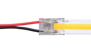
For those managing a B&B or hospitality facility, the best way to create a warm atmosphere in the rooms is to work on multiple lighting levels: ambient light at 2700K, integrated with Neon Flex backlighting along the headboard or false ceiling to delineate volumes without glare. The easiest solutions to install in this context are low-voltage kits with quick connectors, which allow intervention in already furnished rooms without invasive building work. Warm light directly influences the perception of the quality of stay: a well-calibrated environment in terms of colour temperature is perceived as more cared for, and this is measurably reflected in guest reviews.
Catering: enhancing dishes and atmosphere
In the catering sector, the most effective colour temperature for creating an intimate atmosphere typically falls between 2200K and 2700K, a range that enhances skin tones, highlights the warm colours of dishes and creates soft lighting without harsh shadows. Warm light has a direct impact on the perception of food: excessively high temperatures tend to "bleach" dishes and materials, reducing perceived appetising quality, while a well-dosed warm white accentuates the warm and natural components. Among the most cost-effective and quality solutions for this sector are flexible low-consumption LED strips, easily integrated into false ceilings, bar counters and display cases.
Interior design consulting: combining colour and colour temperature
For an interior design consultant, the main characteristics of quality warm light are not limited to the Kelvin value: the Colour Rendering Index (CRI), uniformity along the strip and absence of flicker also matter. Choosing the right lighting for each room means evaluating the predominant function of the environment: bedrooms and living rooms benefit from warm tones, kitchens and bathrooms from a more functional neutral tone, while passage spaces can accommodate intermediate solutions. Correctly combining surface colour and light colour temperature is often the variable that makes the difference between a harmonious environment and one that feels perceptively "dull".
Lighting technicians: efficiency, durability and regulations
For a specialised technician, the most advanced technologies for warm light lighting currently available include high-efficiency LED chips with excellent chromatic stability over time, anti-flicker drivers and dimmable control systems compatible with 0/1-10V, DALI or RF protocols. To improve the energy efficiency of warm light installations, it is good practice to use dedicated power supplies and correctly size cable cross-sections, reducing voltage drops which over time can alter the perceived colour rendering along particularly long strip runs.
7. How to choose and correctly measure colour temperature
Knowing how to choose the correct colour temperature for a project requires method: it is not enough to look at the Kelvin number on the packaging; it must be verified on site and considered in relation to the other light sources present in the space.
Tools for measuring colour temperature
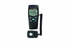
The most reliable way to measure the colour temperature of an installed source is to use a professional colorimeter or spectrophotometer, instruments capable of providing the actual CCT value together with additional data such as CRI and chromaticity coordinates. For quick checks on site or during site surveys, smartphone apps that estimate colour temperature through the device's camera are also available: useful for a first check, but less precise than a dedicated instrument, especially in the presence of mixed natural light.
How to tell at a glance if a light is warm or cool
For those without instrumentation, an empirical method is to compare the source with a sheet of white paper under indirect daylight: if the white tends towards yellow-amber, the source is warm (below 3500K); if it remains neutral, we are in the 3500K-4500K range; and finally if the white takes on a slight blue dominant, the colour temperature exceeds 5000K.
Common mistakes to avoid when choosing colour temperature
- Choosing the Kelvin value without considering the CRI, obtaining colours that are correct in temperature but not very faithful;
- Mixing different colour temperatures in the same visual environment without a design criterion;
- Not taking into account the natural light entering through windows at different times of the day;
- Using the same colour temperature for very different functions (relaxation and work) in the same environment, without providing tuneable CCT systems;
- Ignoring the cultural expectations of the destination market in international projects.
8. 2nd generation Neon Flex: designing custom colour temperature
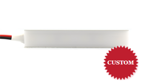
All the principles described so far find a very concrete application when working with 2nd generation Neon Flex solutions, available on Ledpoint.it in a wide range of colour temperatures, from warm white 2200-3500K to cool white, including neutral white and RGB and tuneable CCT versions. This versatility allows the light tone to be precisely calibrated according to the design context and destination market, applying exactly the international logics described in the previous chapter.
Why colour temperature is central to the choice of Neon Flex
2nd generation Neon Flex is often used to delineate architectural volumes, false ceiling profiles, signs and continuous light lines: elements that, due to their extension and visibility, make every deviation in colour temperature immediately perceptible. For this reason, the selection of the correct Kelvin value (warm for hospitality and residential, neutral or cool for retail and technical environments) must be decided upstream of the project, in coherence with what has been illustrated in the chapters on visual perception and international preferences.
Custom cutting: the cutter for 2nd generation Neon Flex
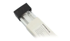
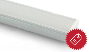
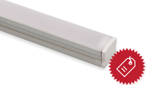
One of the aspects most appreciated by professionals working with this type of product is the possibility of cutting the Neon Flex to size directly on site, adapting the length of the strip to the actual linear developments of the project without material waste. To guarantee a clean, safe cut free from burrs that could compromise the IP rating or the aesthetic rendering of the profile, Ledpoint offers the Cutter for cutting 2nd generation Neon Flex (code NE6-TOOL), a dedicated tool compatible with the NE6 2nd generation models.
This accessory is designed to be used together with the main product (the strips of the Neon Flex 2nd generation range) and allows installers and designers to intervene with millimetric precision at the cutting points provided along the profile, maintaining the integrity of the circuit and the correct chromatic emission along the entire installed length. An imprecise cut, in addition to the aesthetic risk, can in fact generate voltage drops or shadow areas that alter the uniform perception of colour temperature along the development of the light line, a defect particularly evident in visible architectural installations.
Best installation practices for uniform colour temperature
- Always cut at the points indicated on the profile, using a dedicated tool such as the NE6-TOOL cutter to avoid damage to the conductors;
- Verify the declared colour temperature on the technical data sheet and, when possible, test a sample in the real context before final installation;
- Use correctly sized power supplies and drivers to avoid voltage drops that can slightly alter the colour rendering on longer runs;
- In international projects, select the colour temperature consistent with the expectations of the local market, while maintaining chromatic uniformity between the different environments of the same building.
In this way, the combination of a quality product such as 2nd generation Neon Flex and a dedicated cutting accessory allows all the design choices related to colour temperature analysed in this guide to be put into practice without technical compromises.
9. Frequently asked questions about colour temperature
What is colour temperature?It is the parameter, expressed in Kelvin degrees, that describes the chromatic tone of the white light emitted by a source: from the yellow-amber of low temperatures to the white-blue of high temperatures. |
What is Kelvin?Kelvin is the unit of measurement used to classify the colour temperature of light sources, with values ranging from about 1000K (candlelight) to over 15000K (deep blue sky). |
What is the difference between warm and cool light?Warm light (2200K-3000K) has a yellow-amber dominant and creates welcoming atmospheres; cool light (5000K and above) has a white-blue dominant and is more energising, suitable for technical and work environments. |
What colour is 2700K?2700K corresponds to a warm white very similar to the light of a traditional incandescent bulb: yellow-amber, soft and enveloping. |
What light is 3000K?3000K is a warm white slightly brighter and more neutral than 2700K, widely used in residential, hotel and catering settings. |
What colour is 4000K?4000K corresponds to a neutral white, without evident dominants: it is the most common shade in offices, kitchens and commercial spaces. |
What colour is 5000K?5000K is a cool white light very similar to midday daylight, often used in healthcare environments, laboratories and technical spaces. |
What colour is 6500K?6500K is an intense cool white light with a blue dominant, similar to daylight in overcast conditions: it is used in industrial settings and technical backlighting. |
Is 4000K or 6000K better?It depends on the function of the environment: 4000K is more balanced and suitable for most commercial and domestic spaces, while 6000K is preferable in technical environments where maximum visual rendition and alertness are required. |
How is colour temperature measured?With a professional colorimeter or spectrophotometer, or, for indicative checks, with dedicated apps that estimate the CCT value through the smartphone's camera. |
How to choose the correct colour temperature for an environment?By evaluating the predominant function of the space: warm tones for relaxation and hospitality environments, neutral tones for offices and kitchens, cool tones for technical and high-concentration work environments. |
What is the colour temperature of natural light?Natural light varies greatly during the day: from 2000K-3000K at dawn and sunset to 5500K-6500K at midday with a clear sky. |
What does the abbreviation CCT mean in colour temperature?CCT stands for Correlated Colour Temperature: the Kelvin value that describes how close a source's light is to the theoretical light of a black body heated to that temperature. |
Colour temperature: much more than a technical specification
Colour temperature is much more than a technical specification to be entered on a product data sheet: it is the tool with which architects, lighting designers, hospitality managers and restaurateurs build the perceptual experience of an environment, adapting it to the cultural expectations of the reference market and the specific function of each space. Understanding the Kelvin scale, the differences between warm, neutral and cool light, and the variations in preference between different international markets makes it possible to design consistent, effective systems capable of communicating exactly the desired atmosphere.
When these principles are applied to concrete solutions such as 2nd generation Neon Flex, the quality of the final result also depends on the care of execution details: a precise cut, made with the dedicated tool, ensures that the colour temperature chosen during the design phase translates into a uniform, durable and visually impeccable installation.
This article was developed with the support of artificial intelligence and subsequently reviewed, corrected, and validated by the Ledpoint.it technical team, which guarantees its reliability and compliance with official sources.